Typography
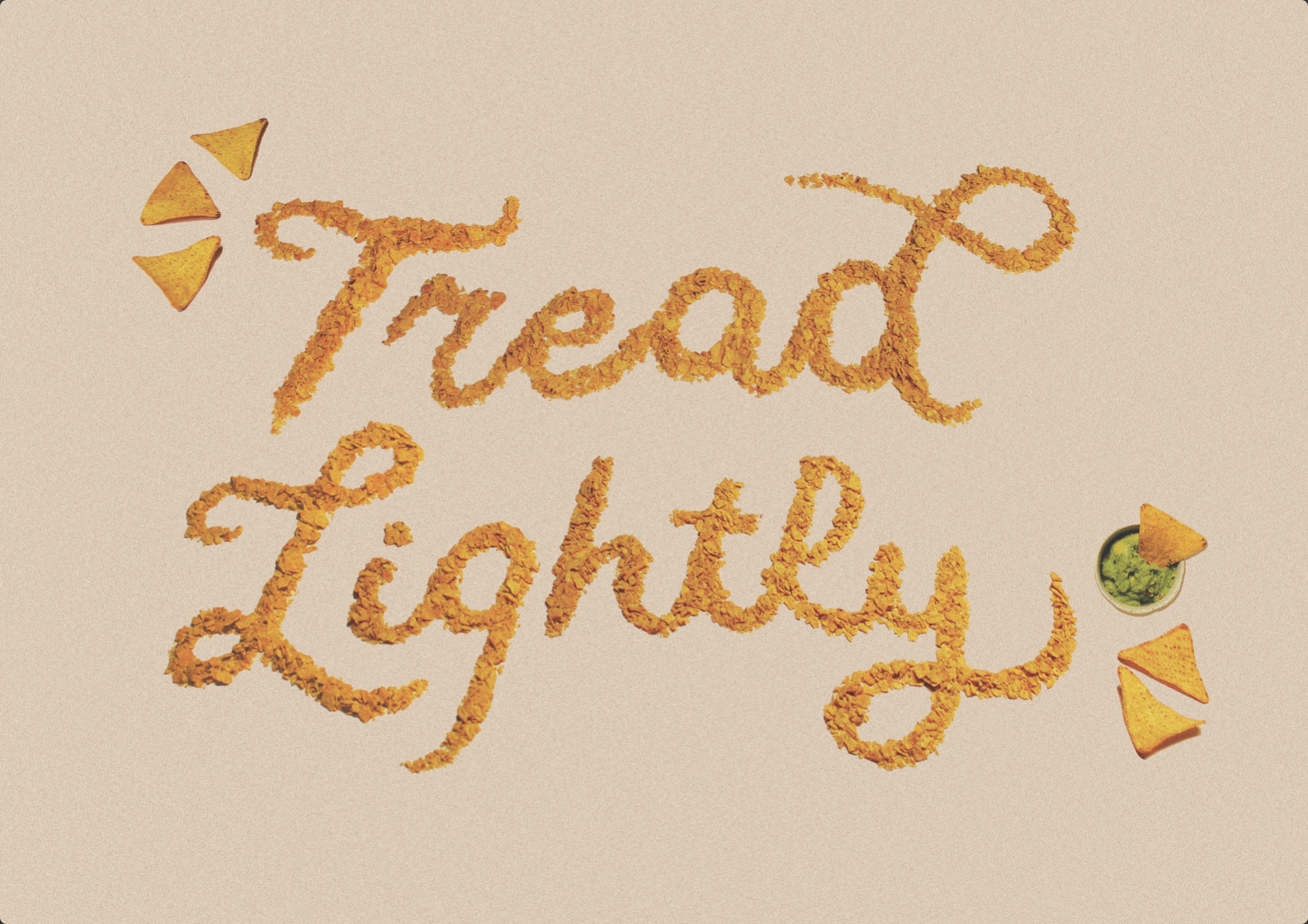
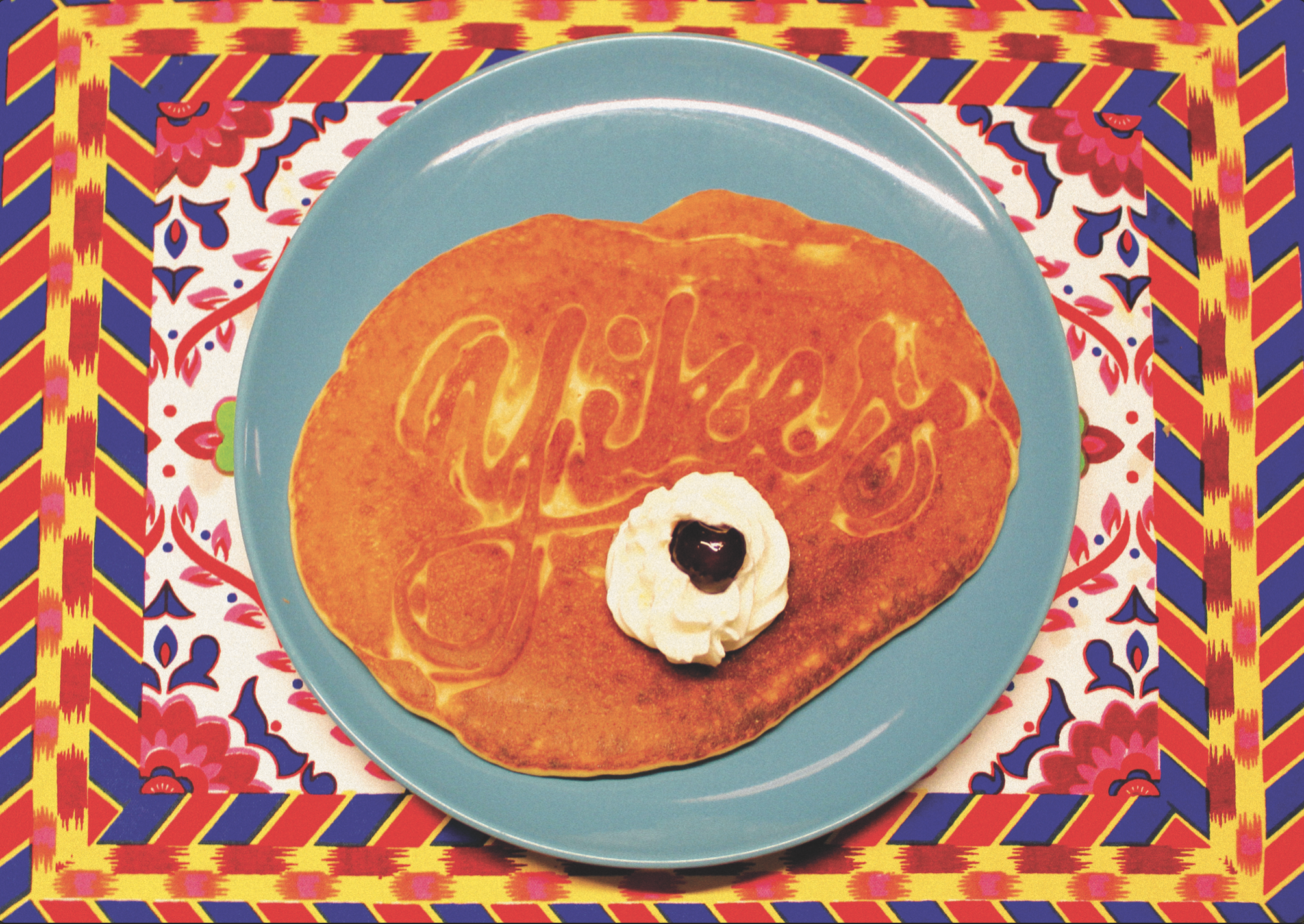
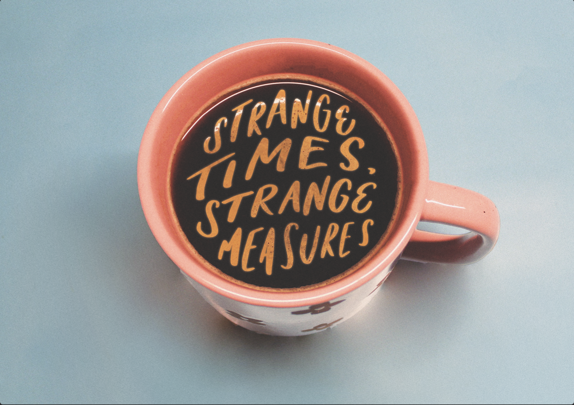
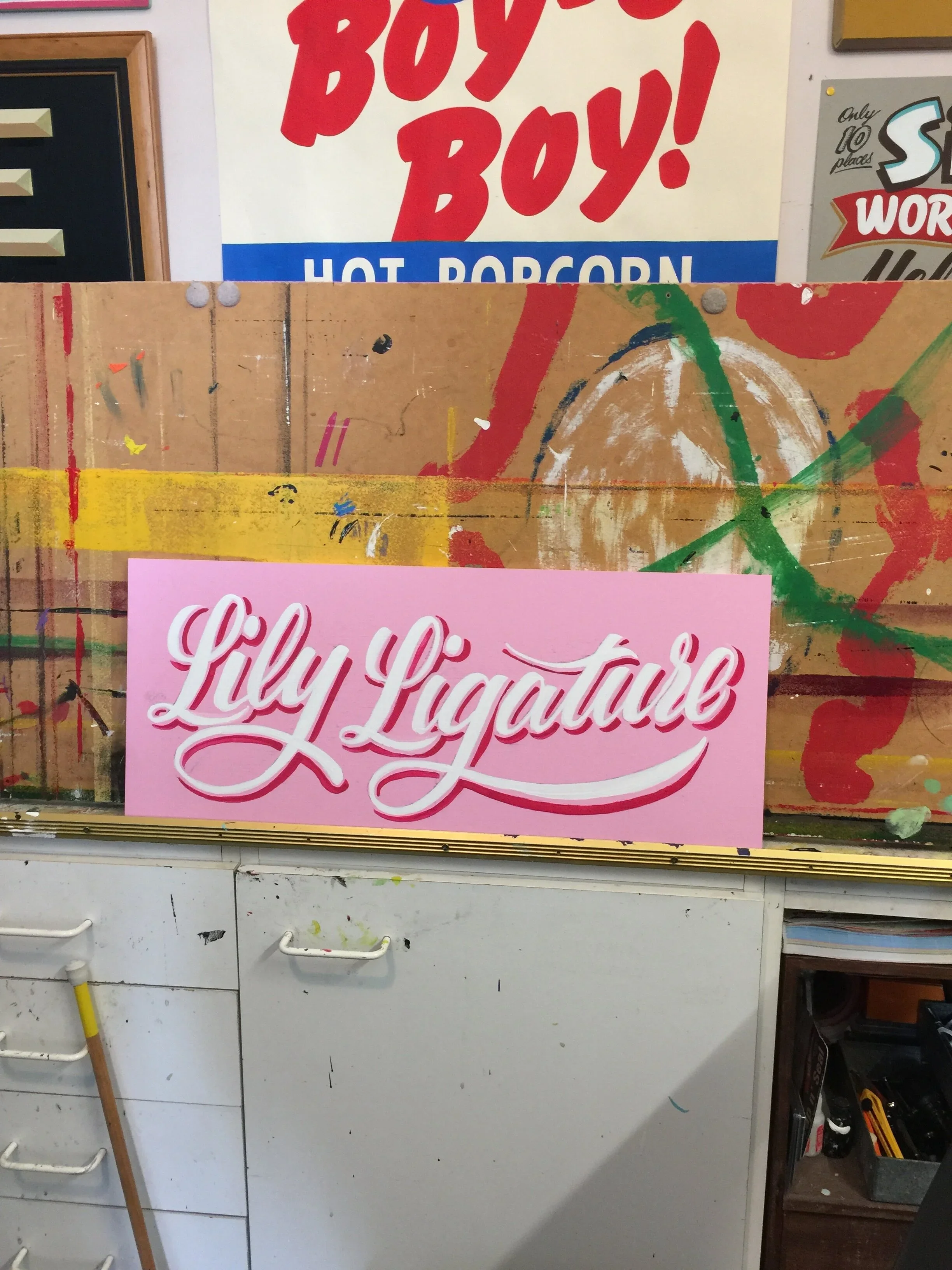
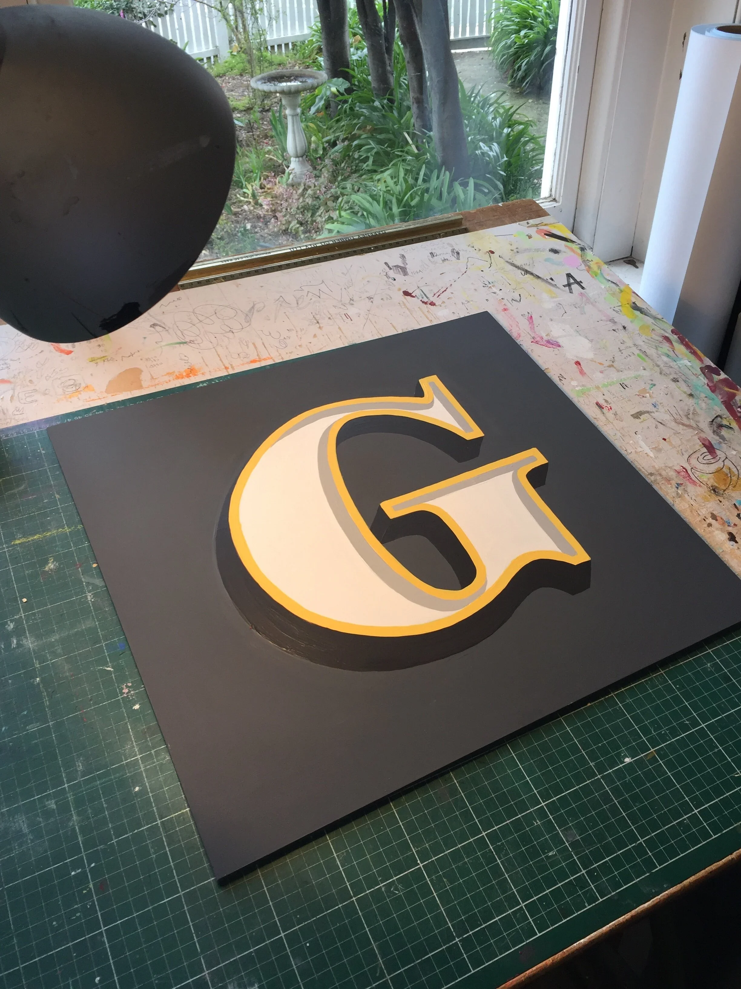
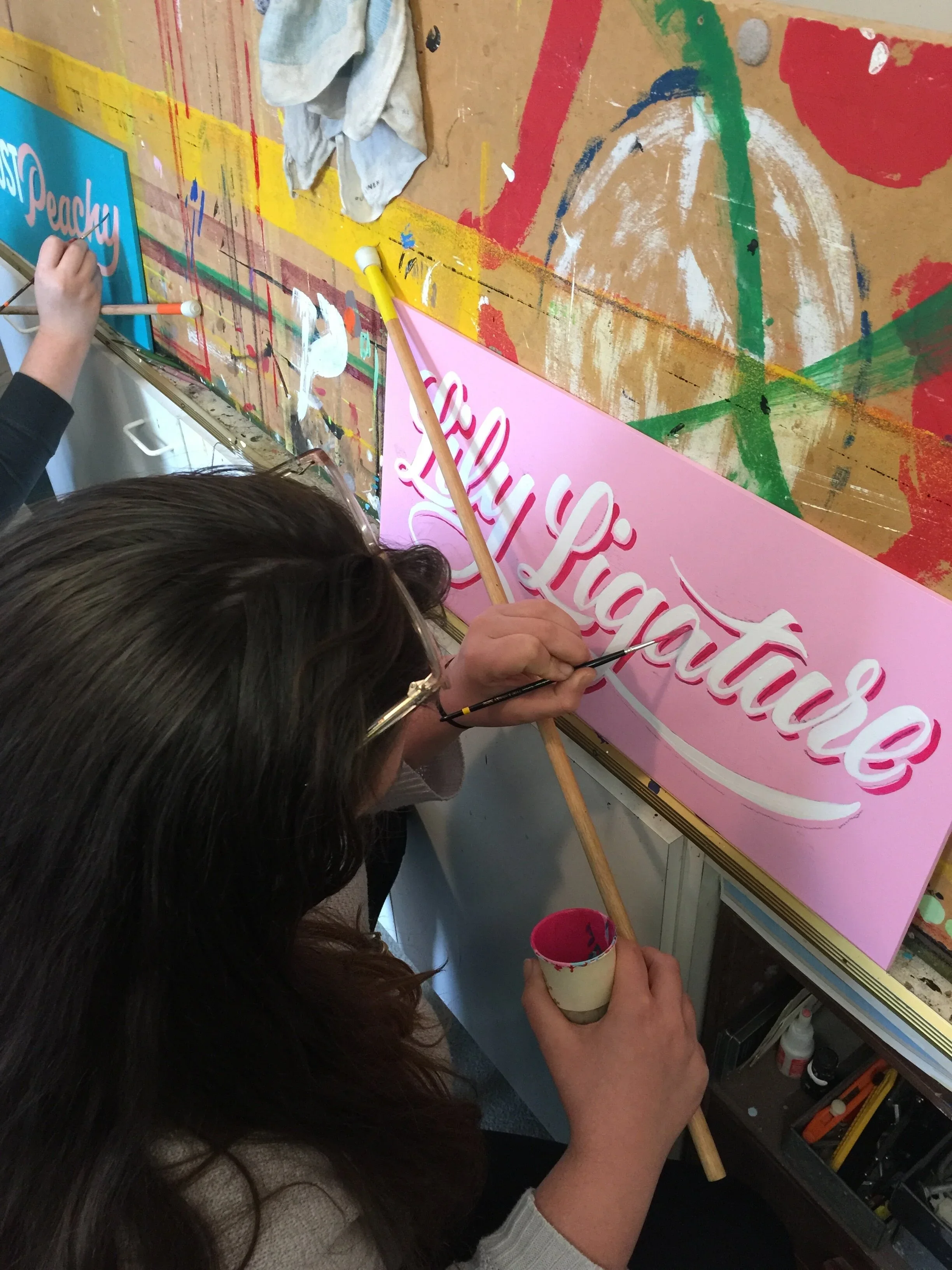
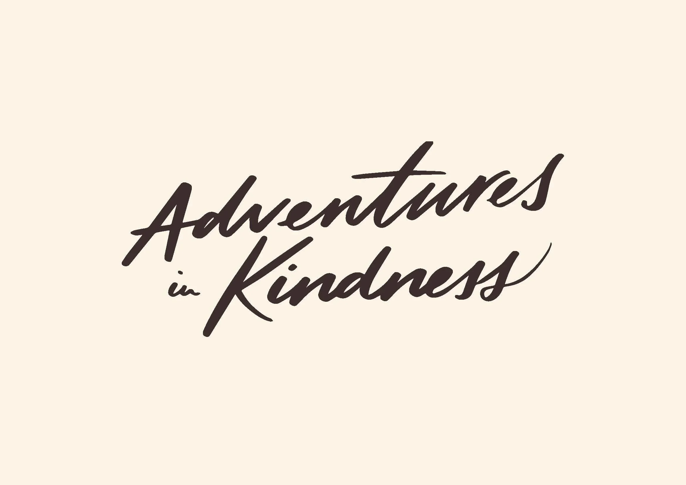
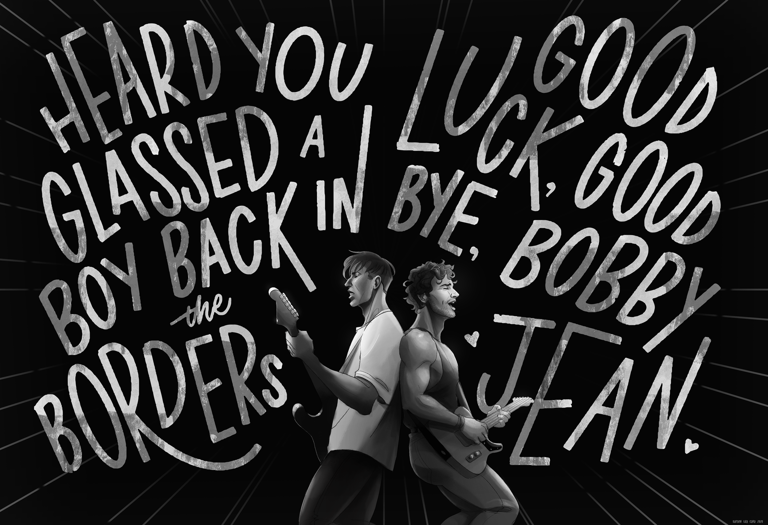
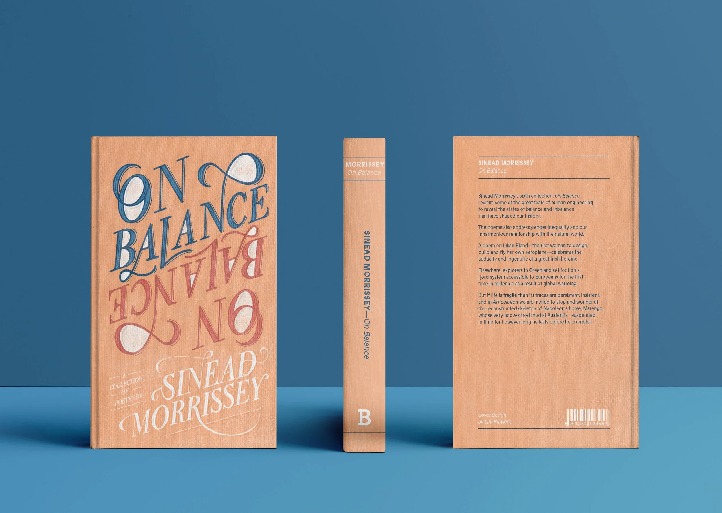
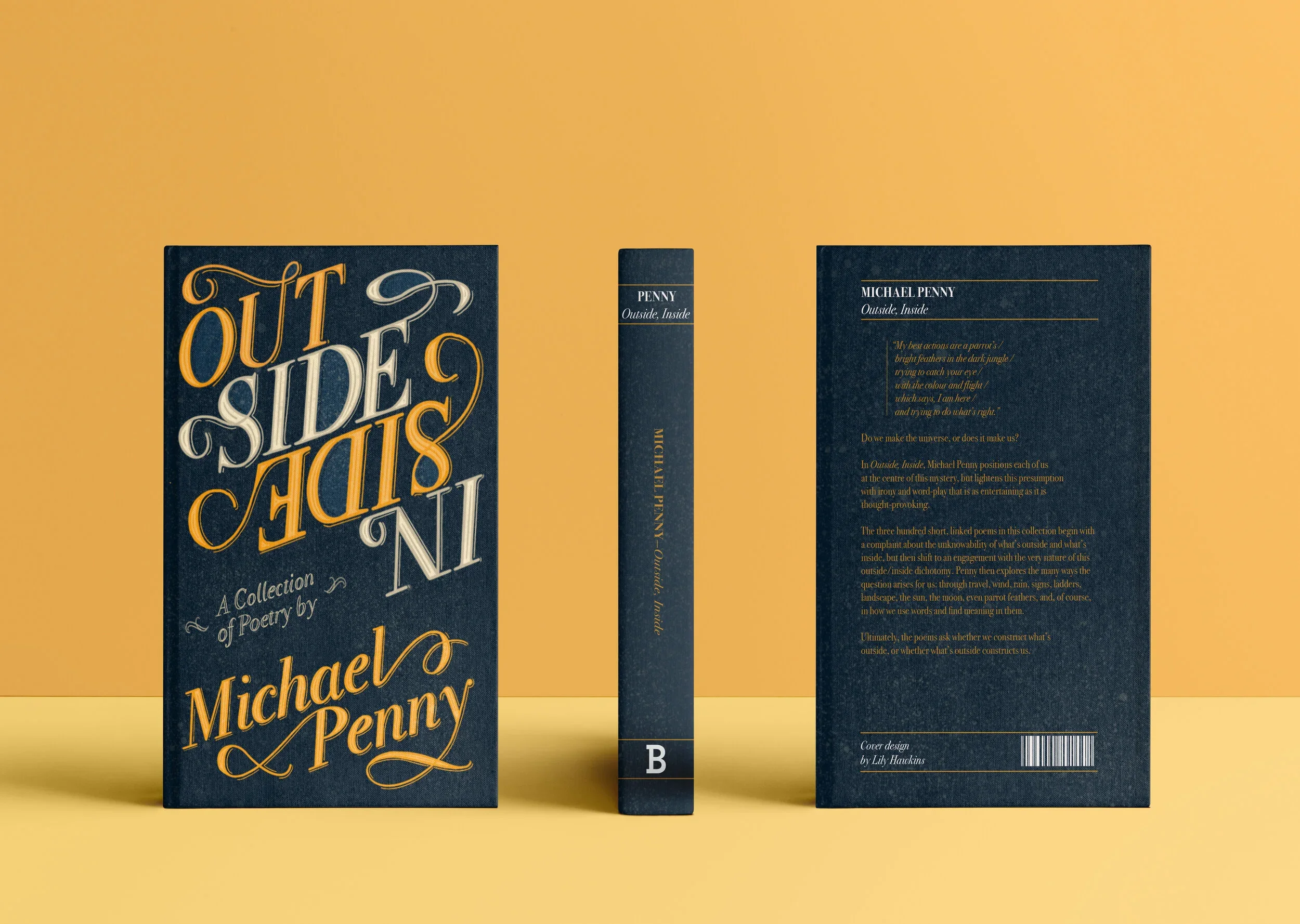
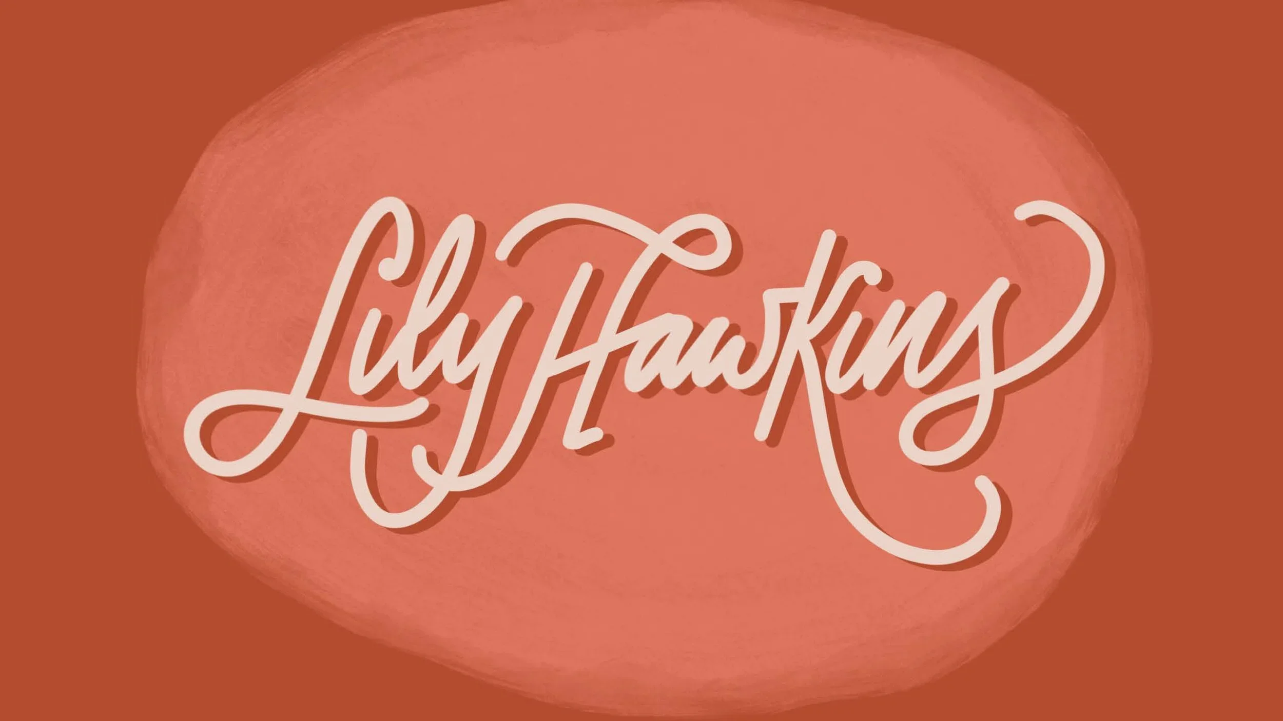
Typography is a particular passion in my design practice. I have an excellent knowledge of typographic principles, and extensive experience with hand lettering, including brush lettering, chalk and traditional sign painting. In the last two years I have been working on increasing my knowledge around typeface design, experimenting with turning my hand lettering into working alphabets. Below is a selection of my own typographic works.
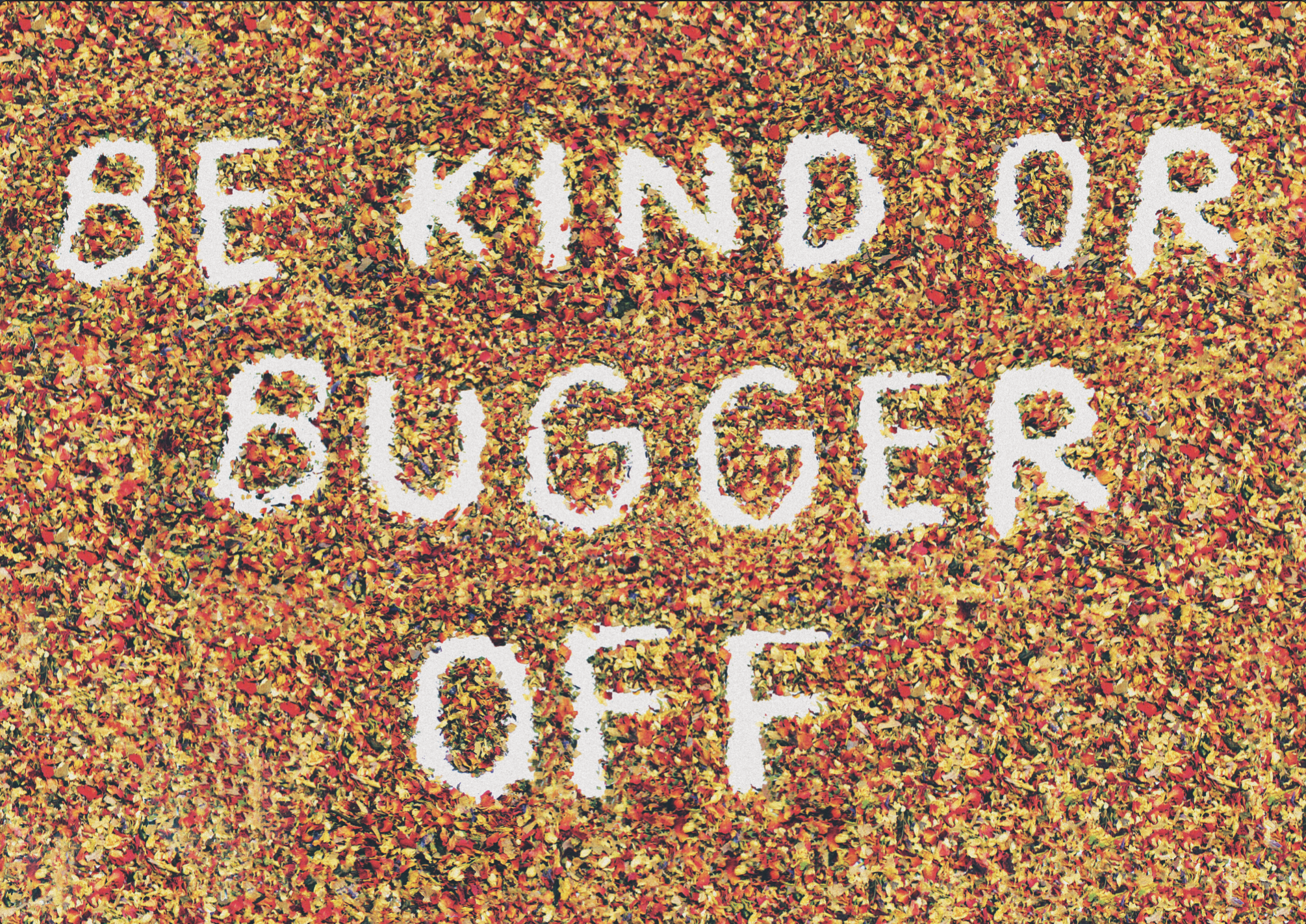
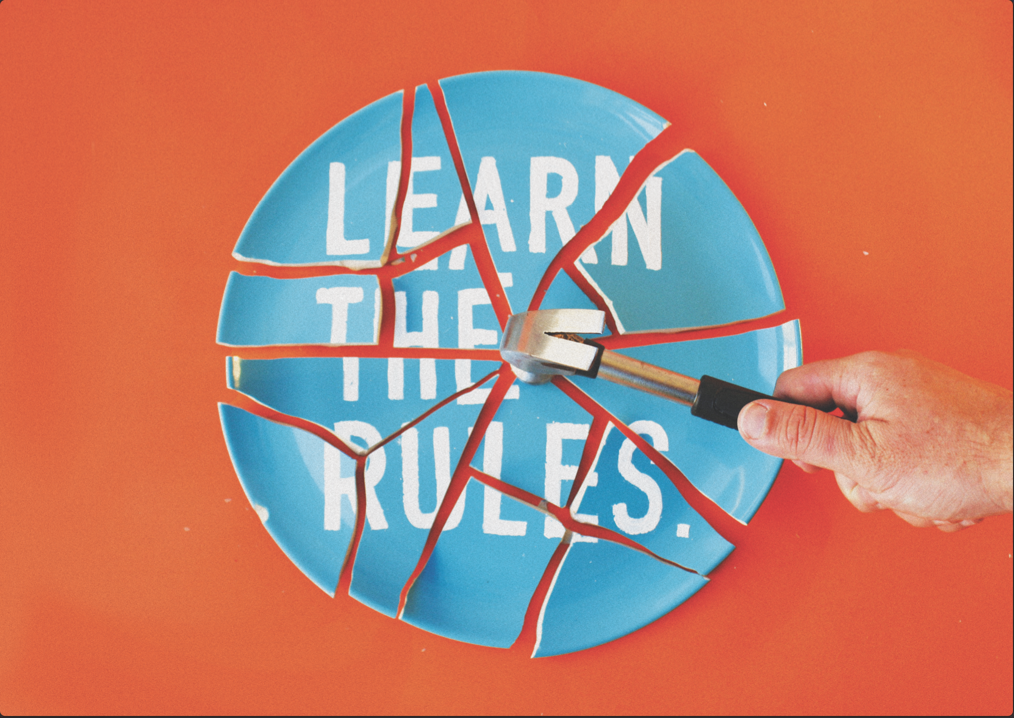
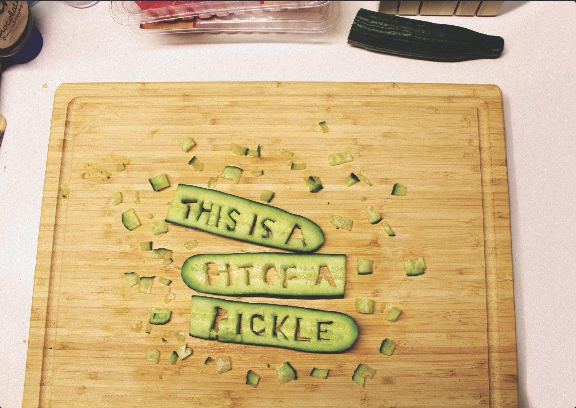
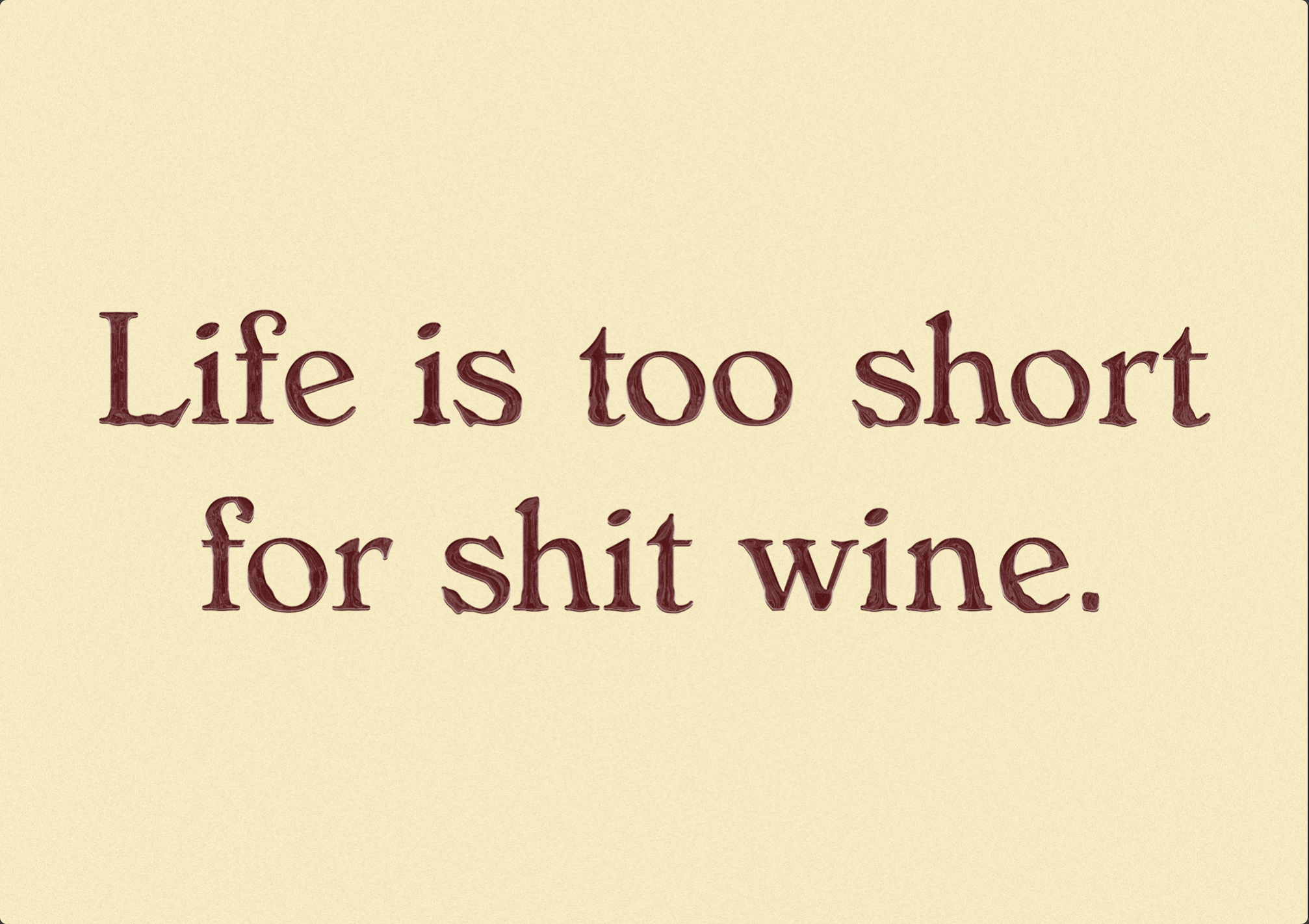

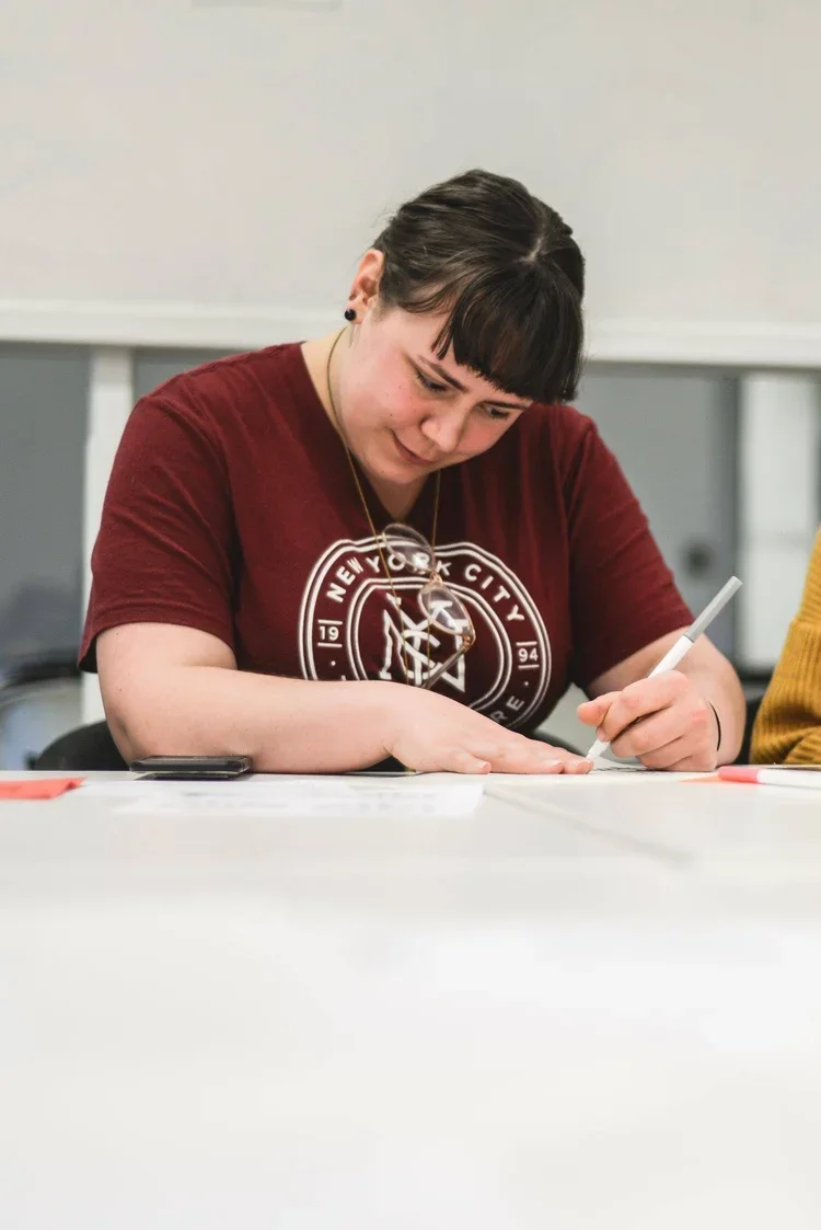
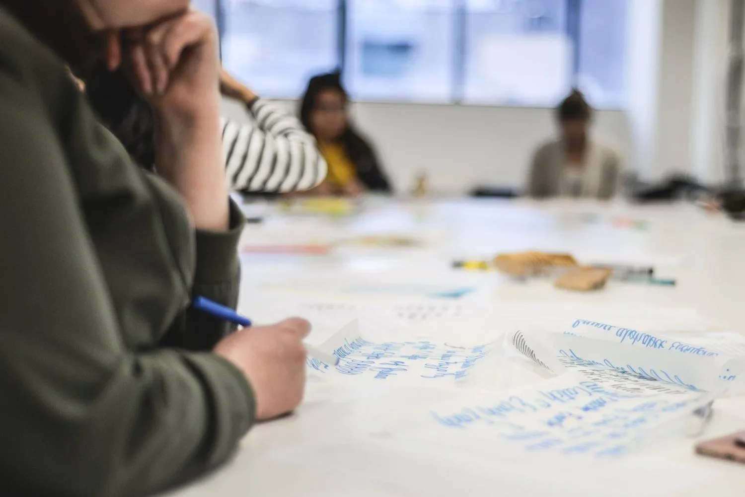
Lettering workshops with the RMIT Comm Design Association
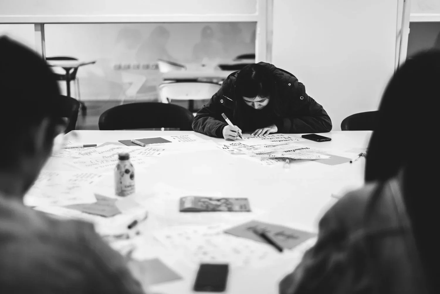
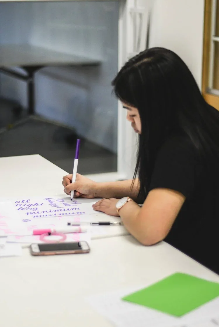
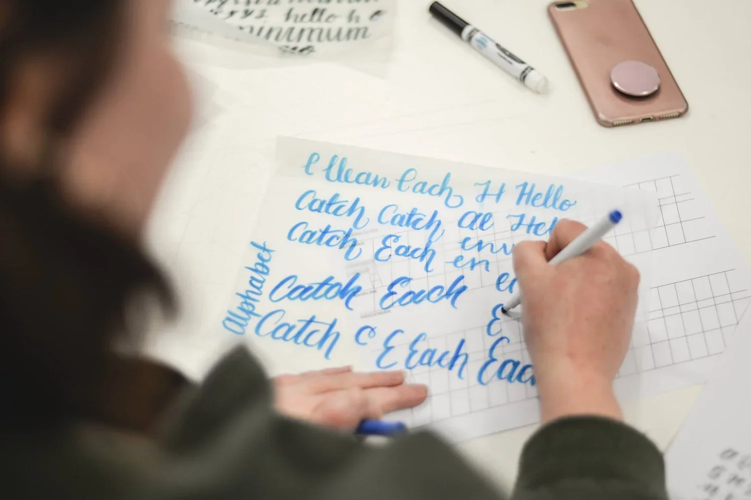
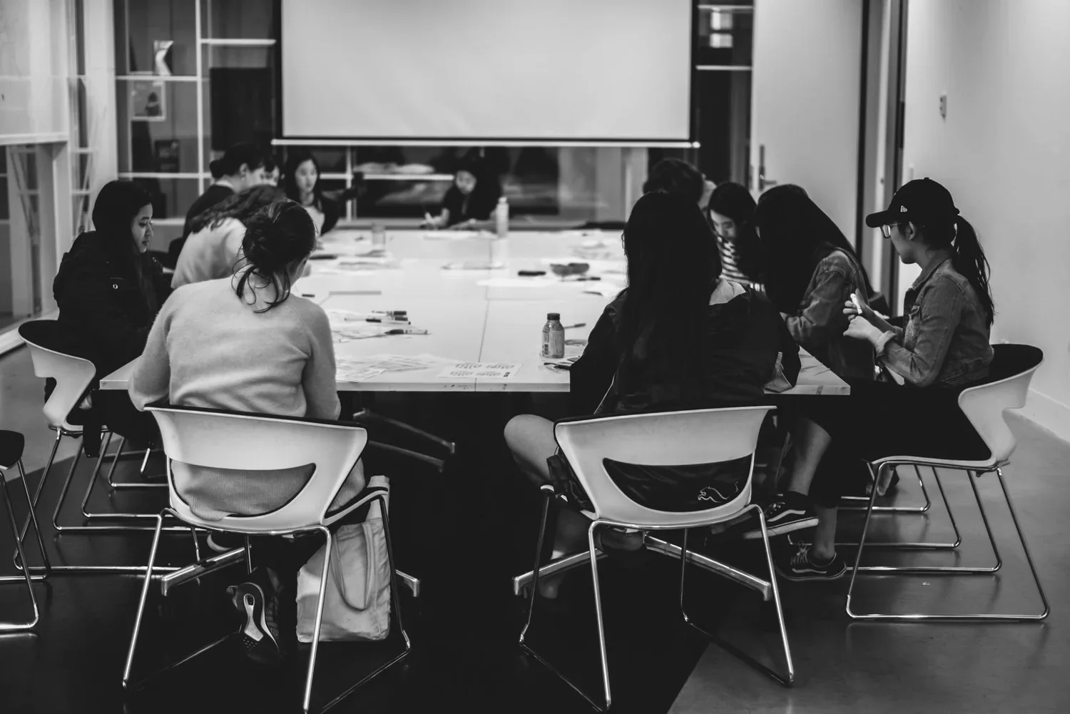
During my second year at RMIT University, I founded and was president of a student club, the RMIT Communication Design Association (CDA). We recruited high achieving students to run lunch time skillshare workshops in their varying areas of speciality.
As part of this, I began lettering workshops and developed a printout to help participants continue learning and practicing. Photos from these workshops, and selected pages from the printable, can be viewed here.
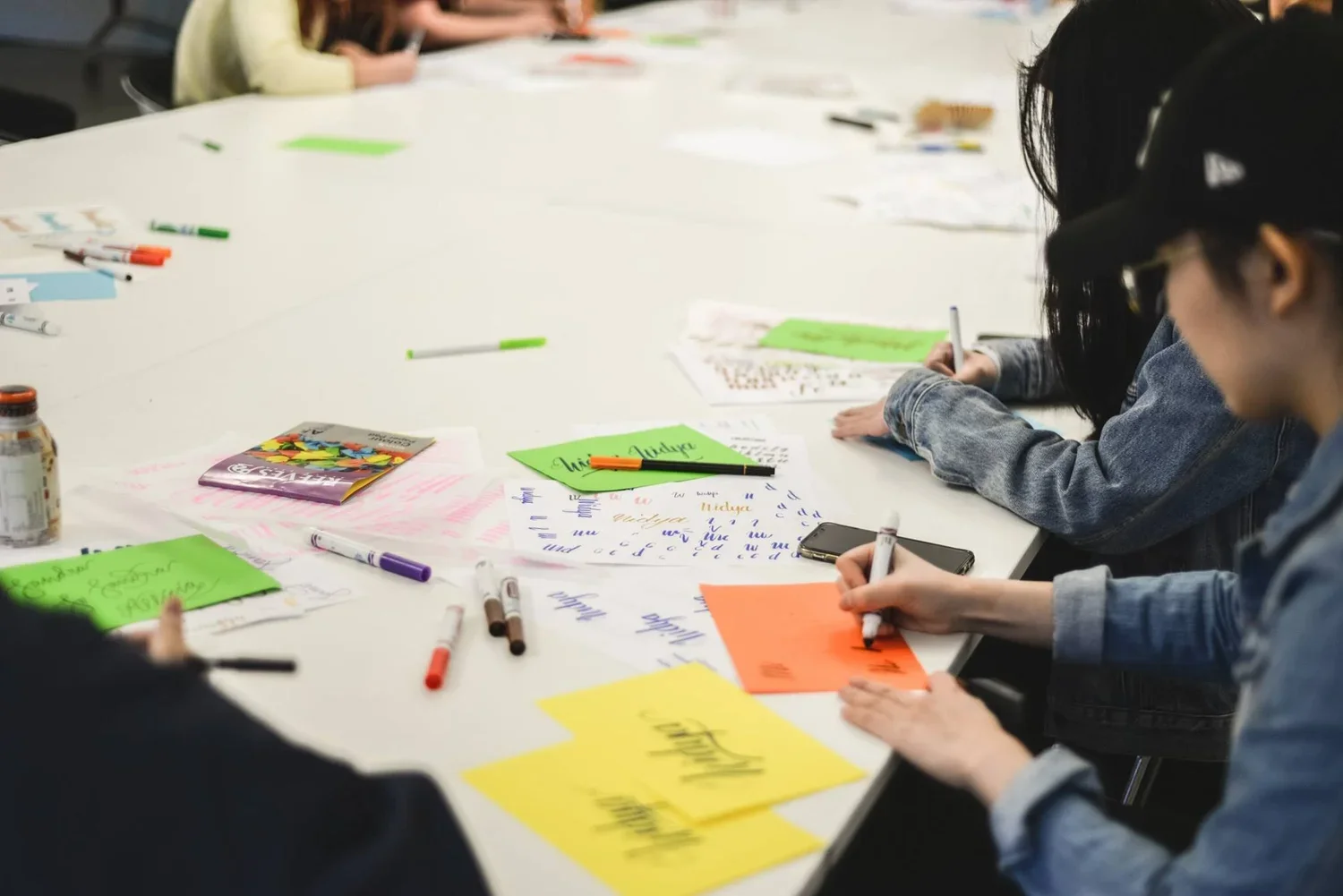
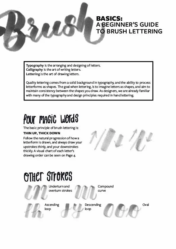
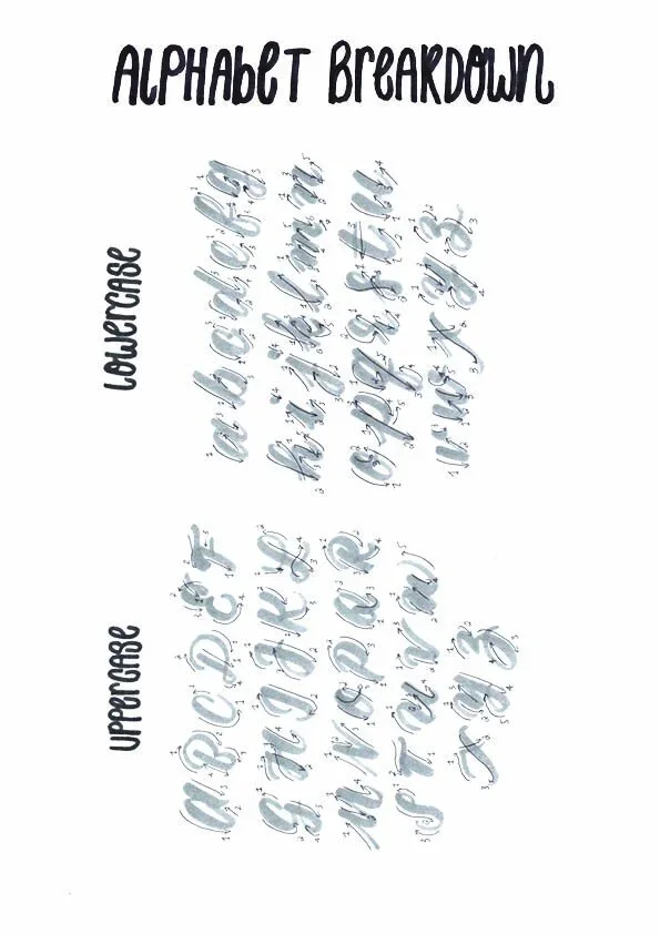
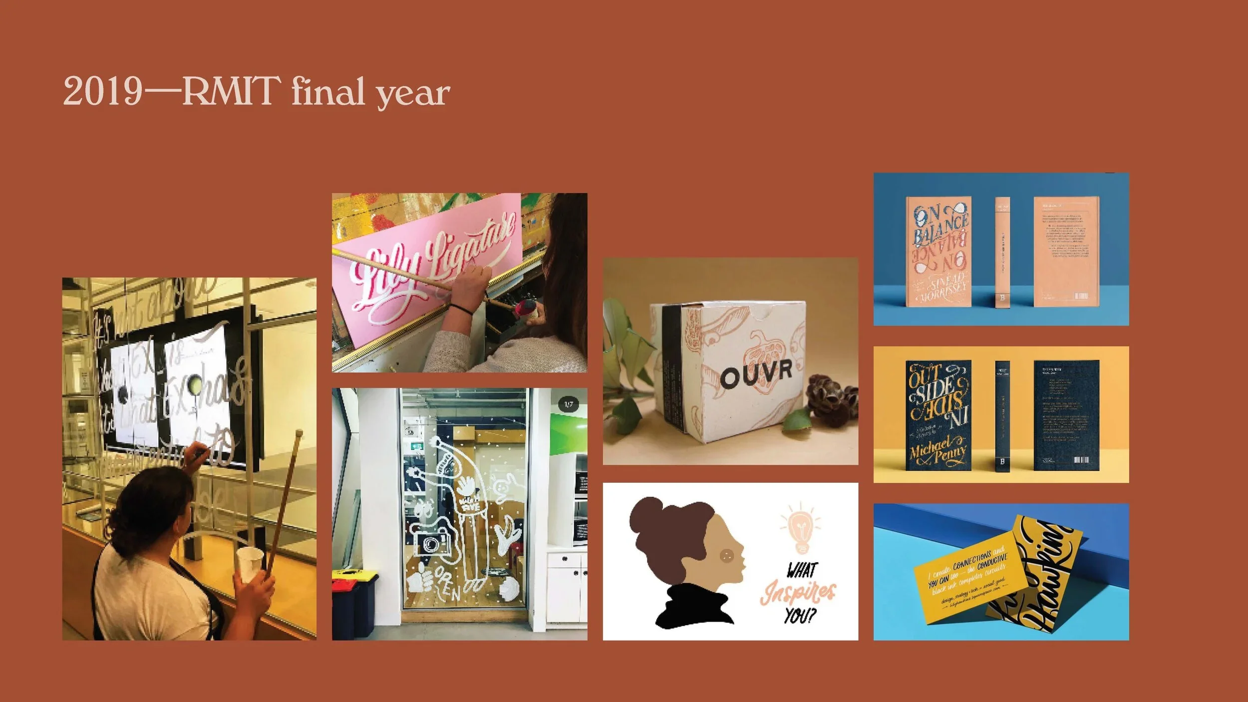

A lettering-forward lecture
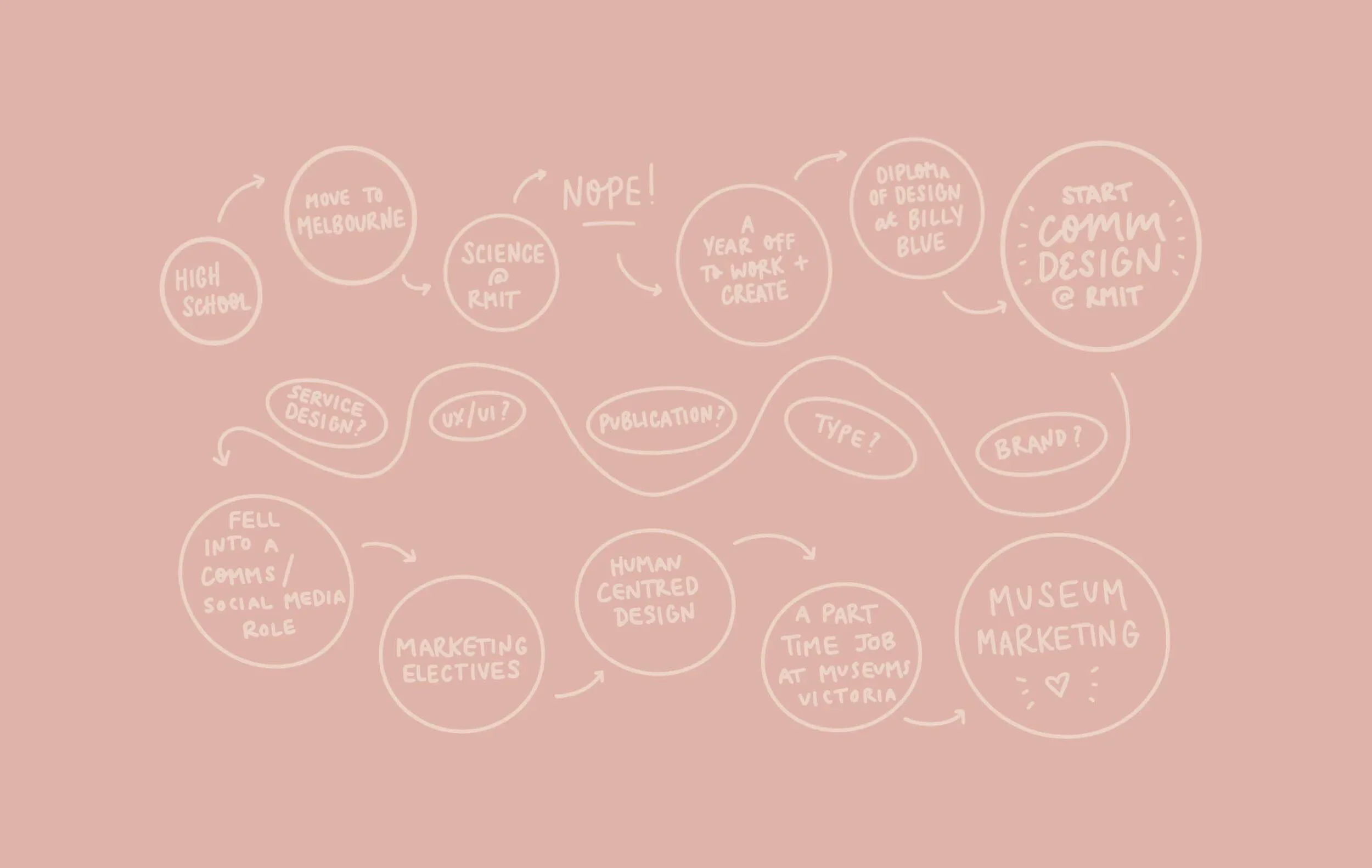
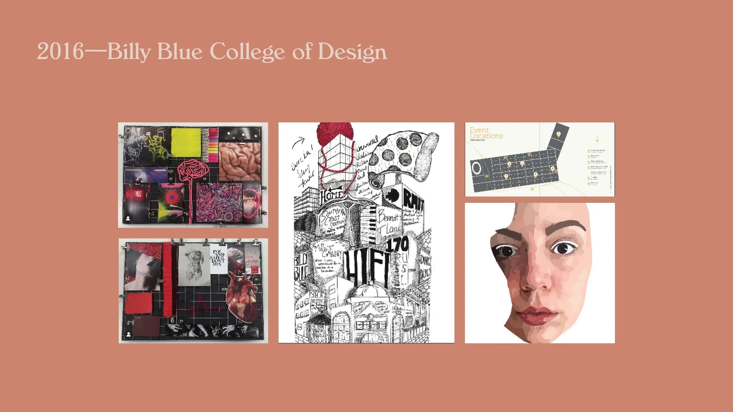
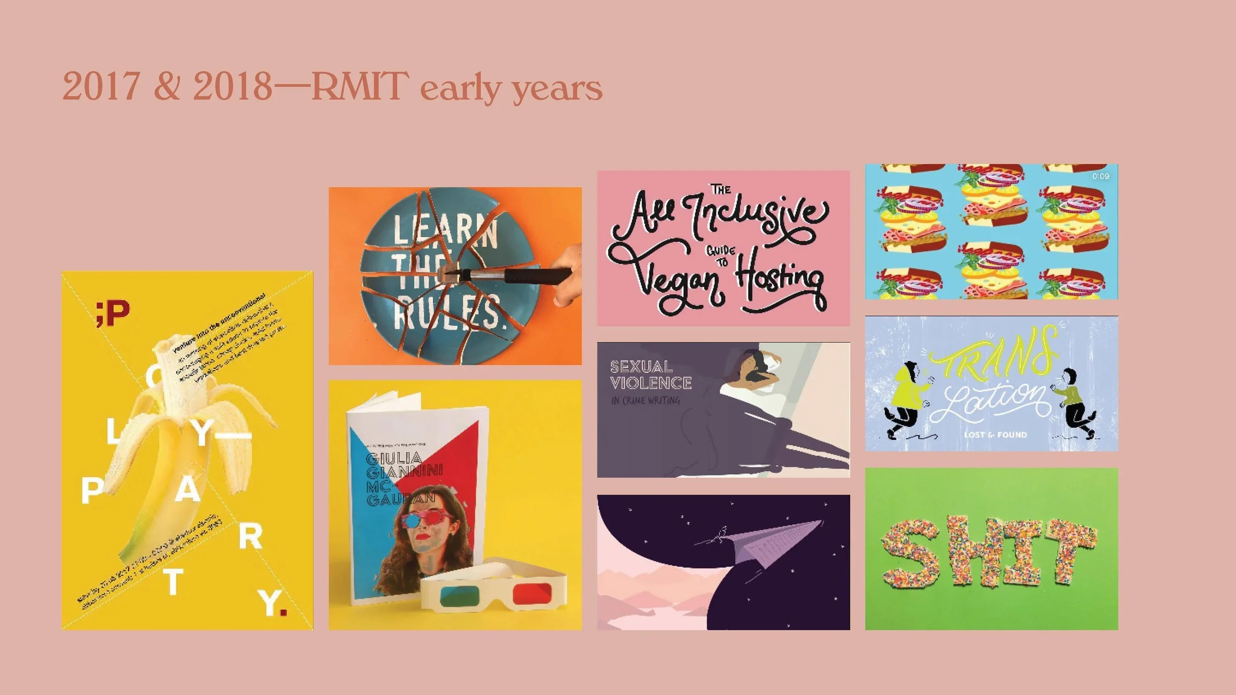
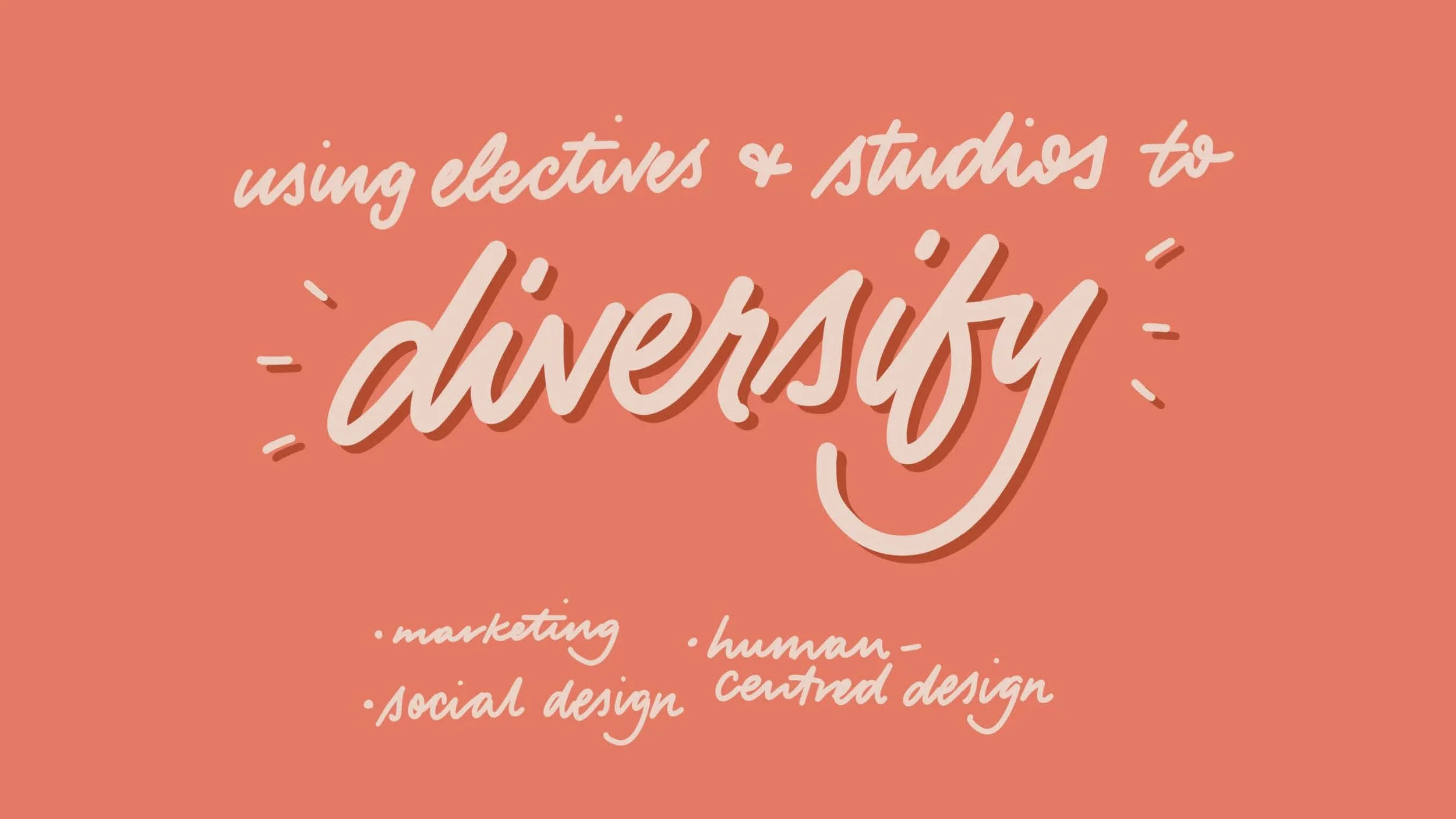
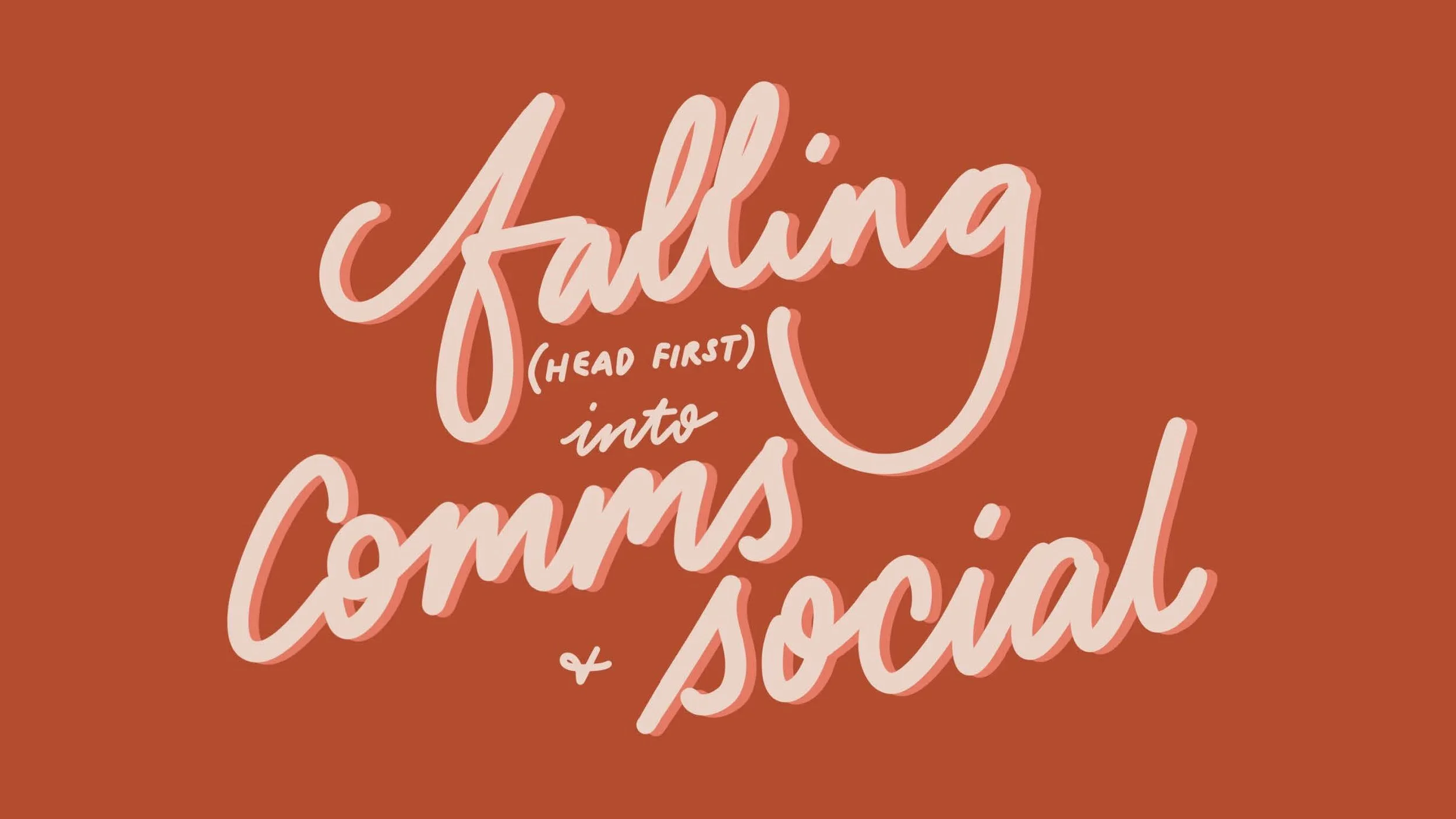
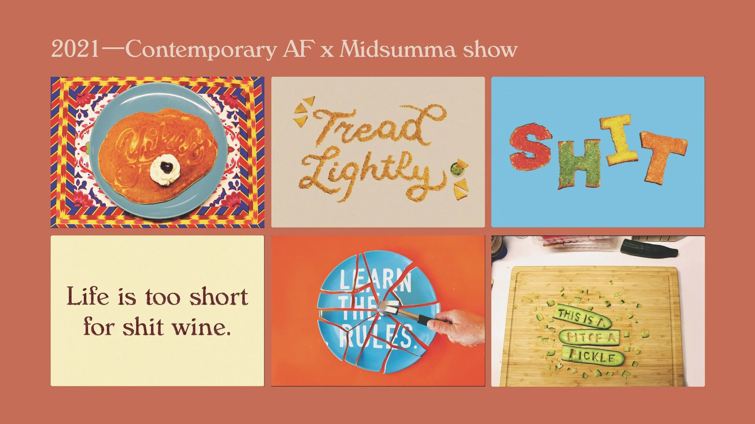
I recently completed an alumni presentation for current Communication Design students at RMIT University. The talk was accompanied by slides outlining my career trajectory and sharing some of my work since leaving university, and many of the slide elements were hand drawn and lettered. Selected slides can be seen here.
Selected student works —
My love for typography began early in my university career. Here are a couple of my favourite type-led projects.
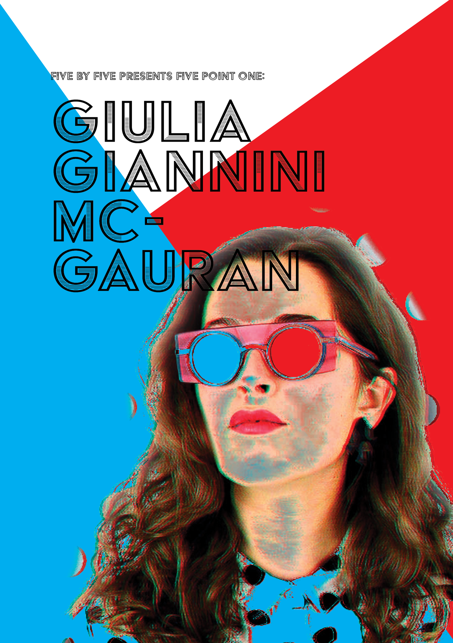
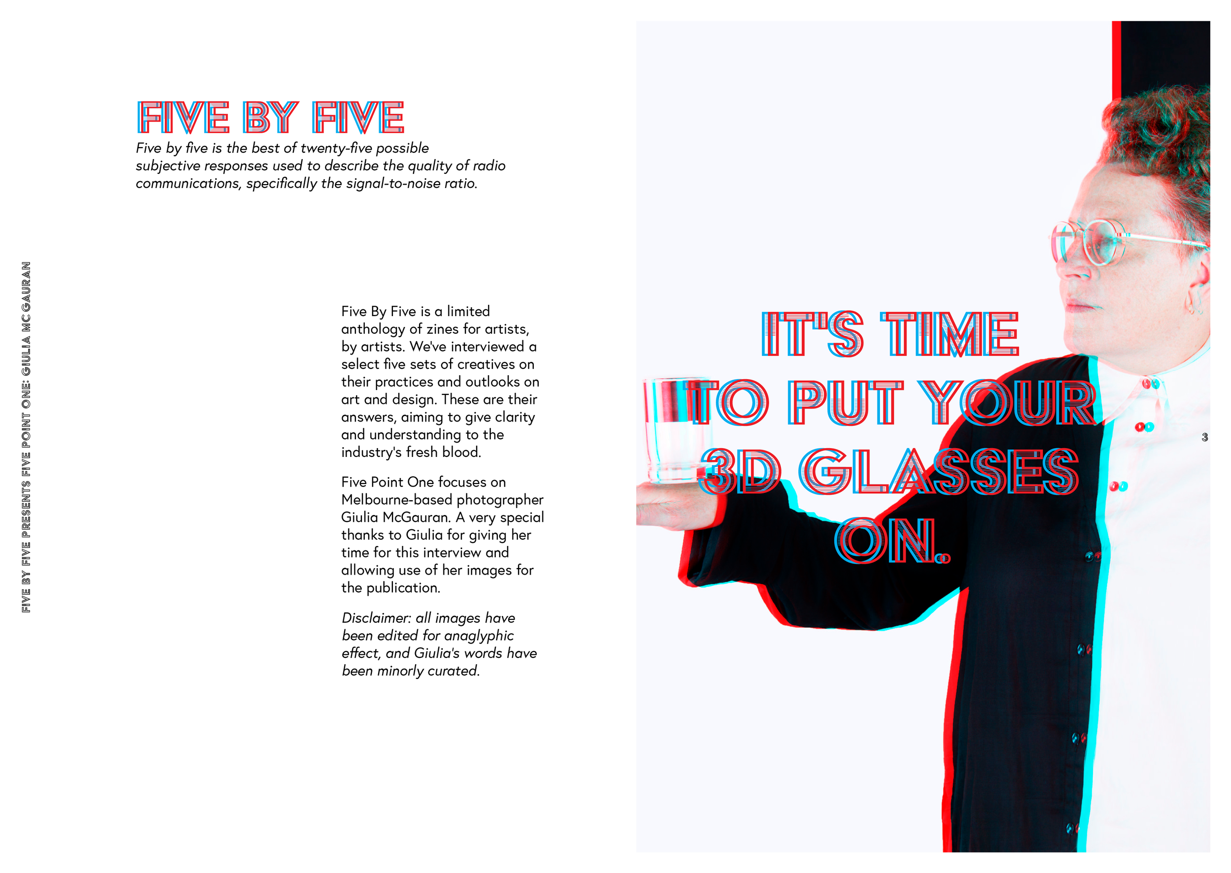
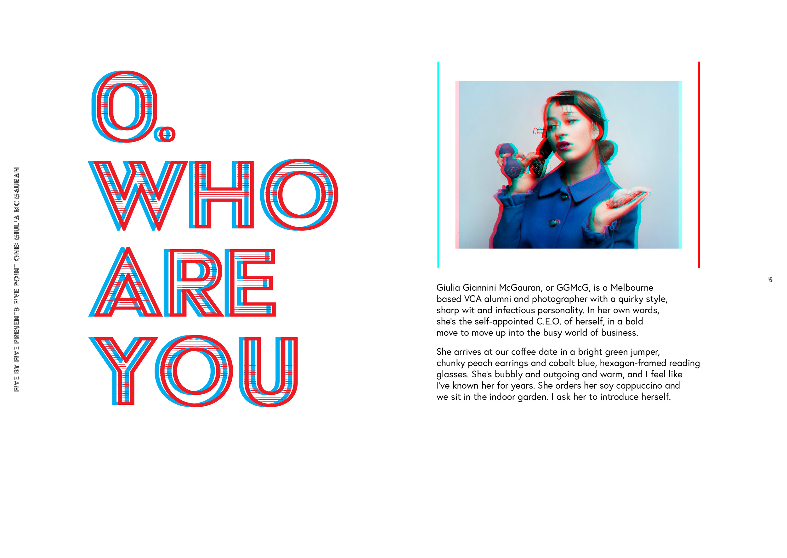
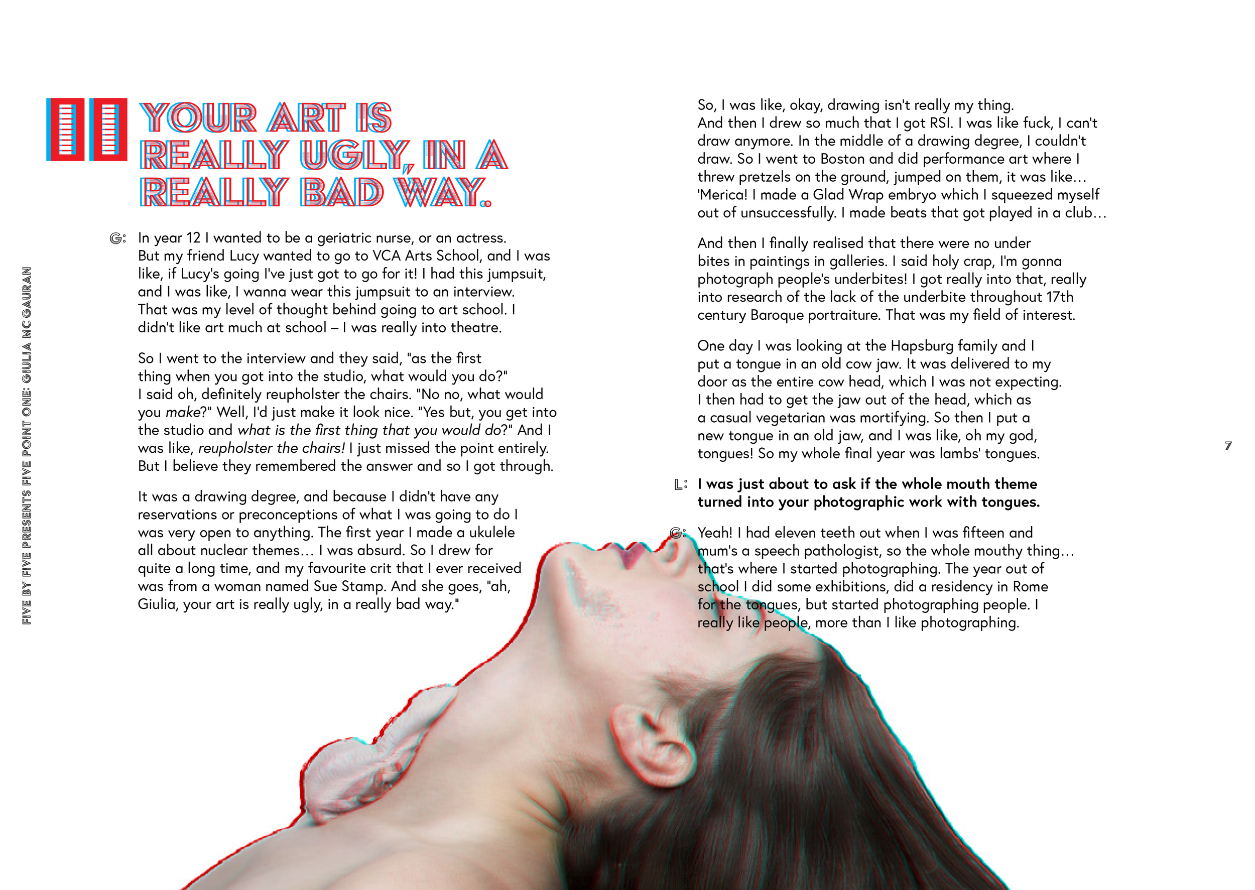
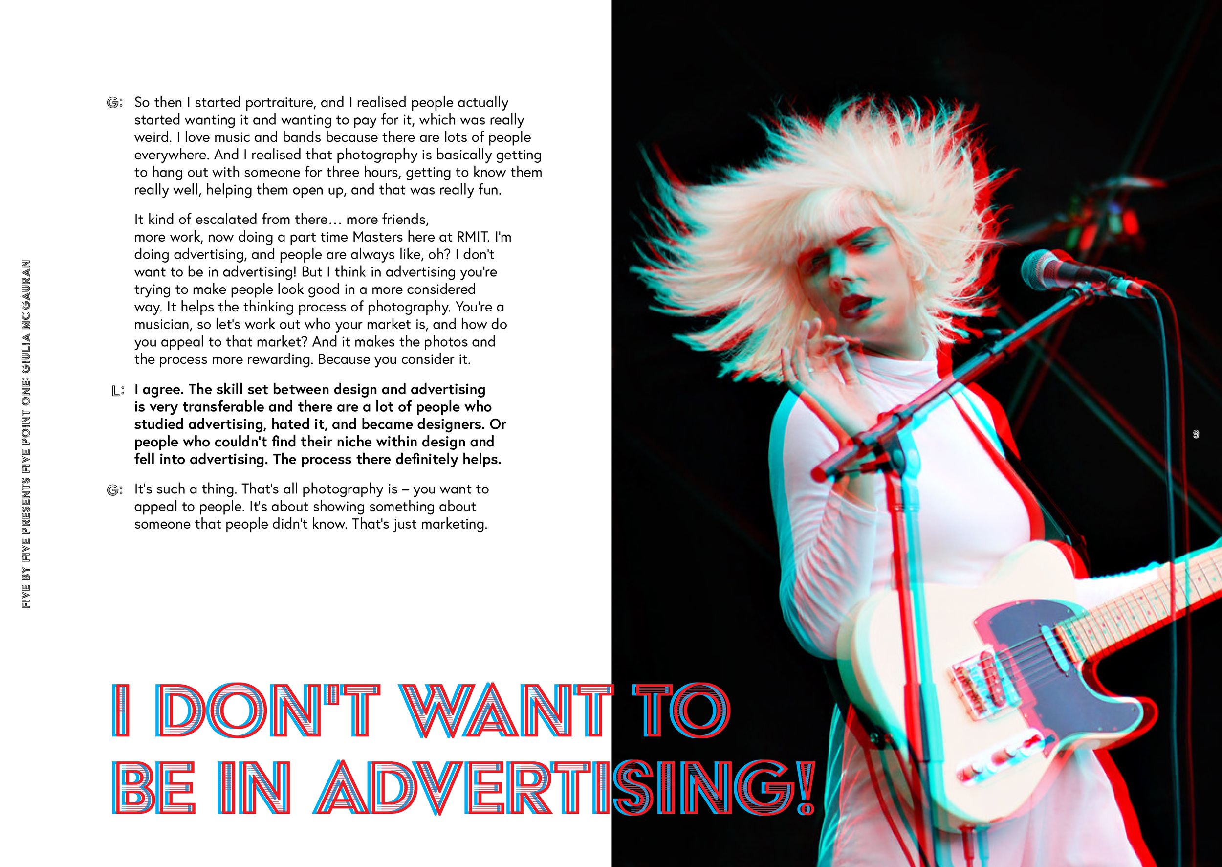
A 3D anaglyphic zine, interviewing Melbourne photographer Guilia Giannini McGauran on her creative practice.
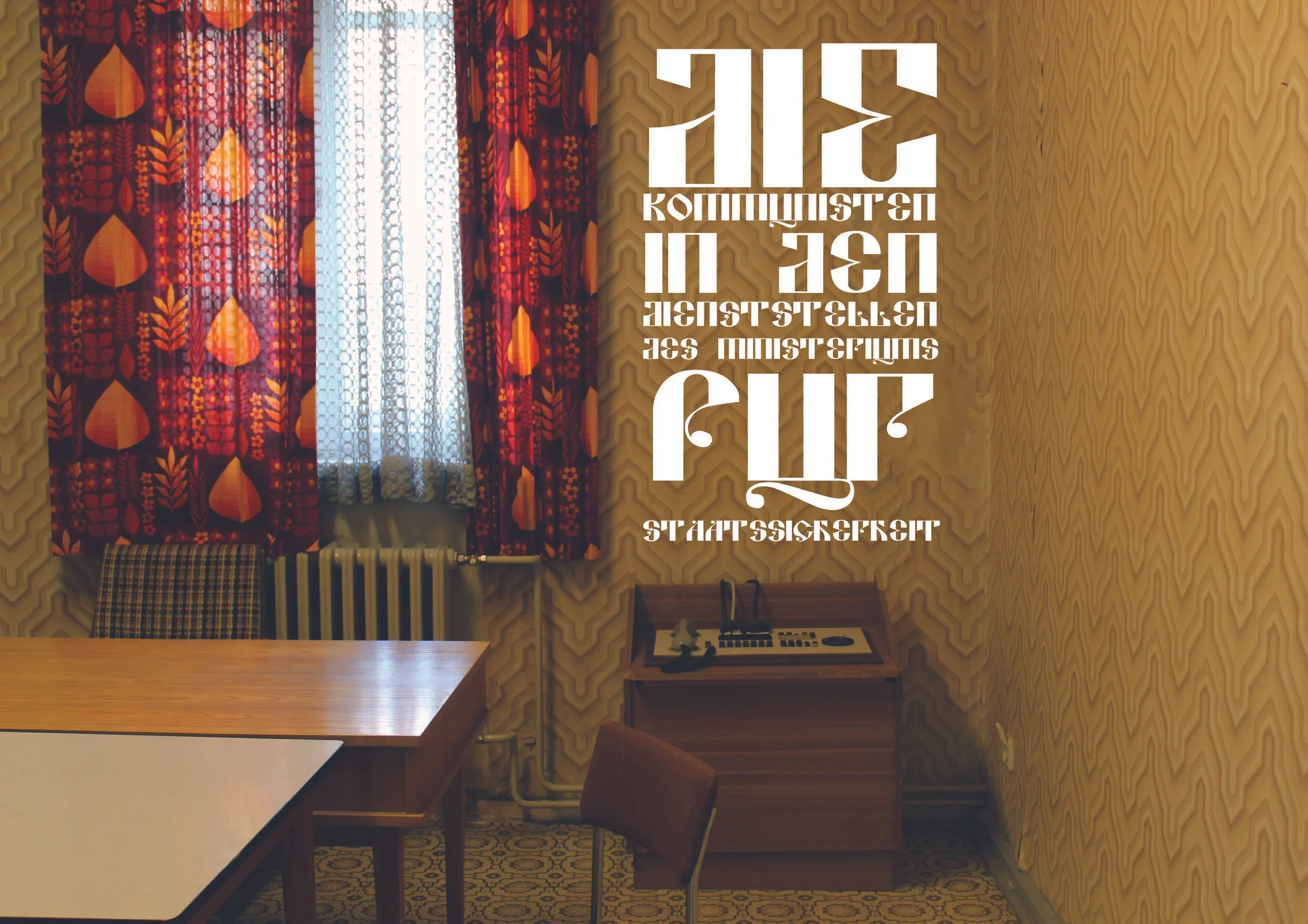
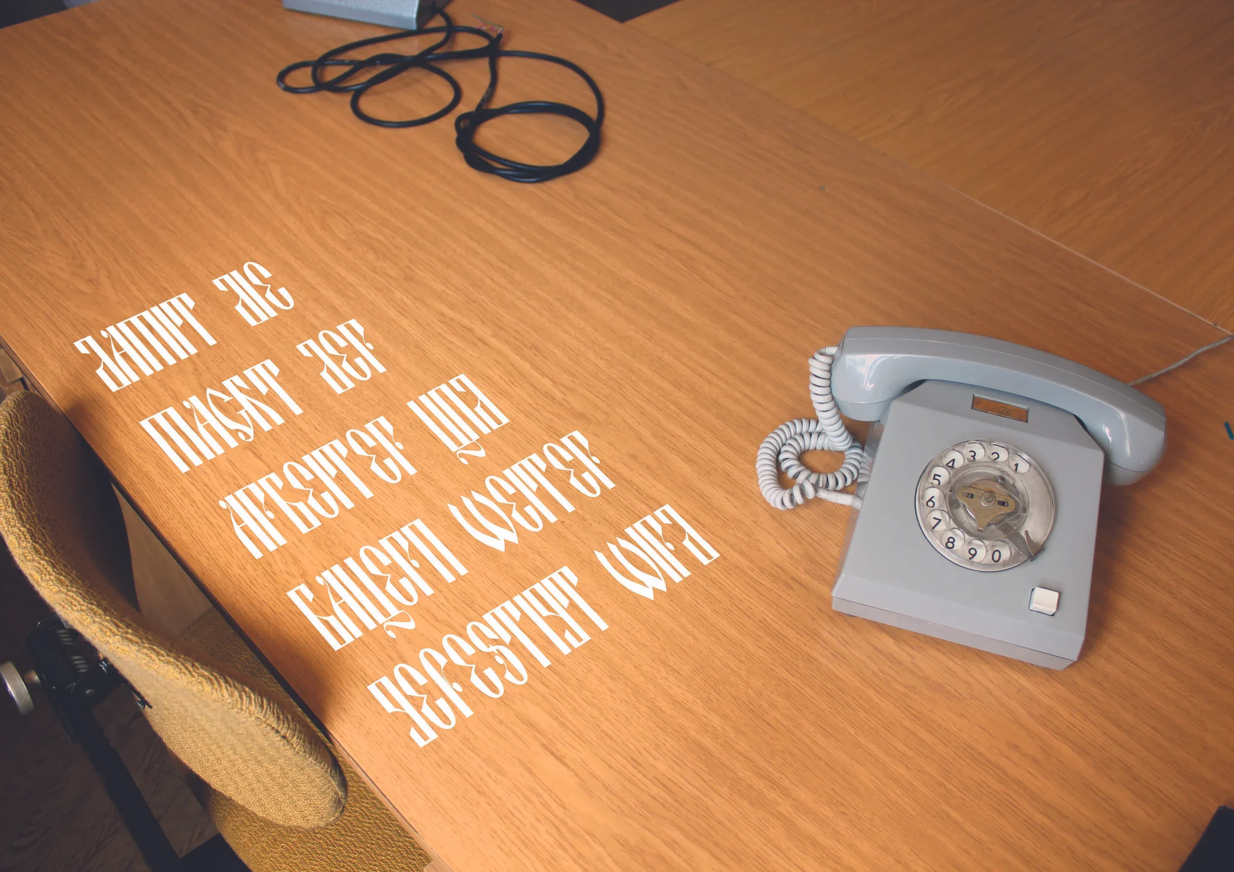
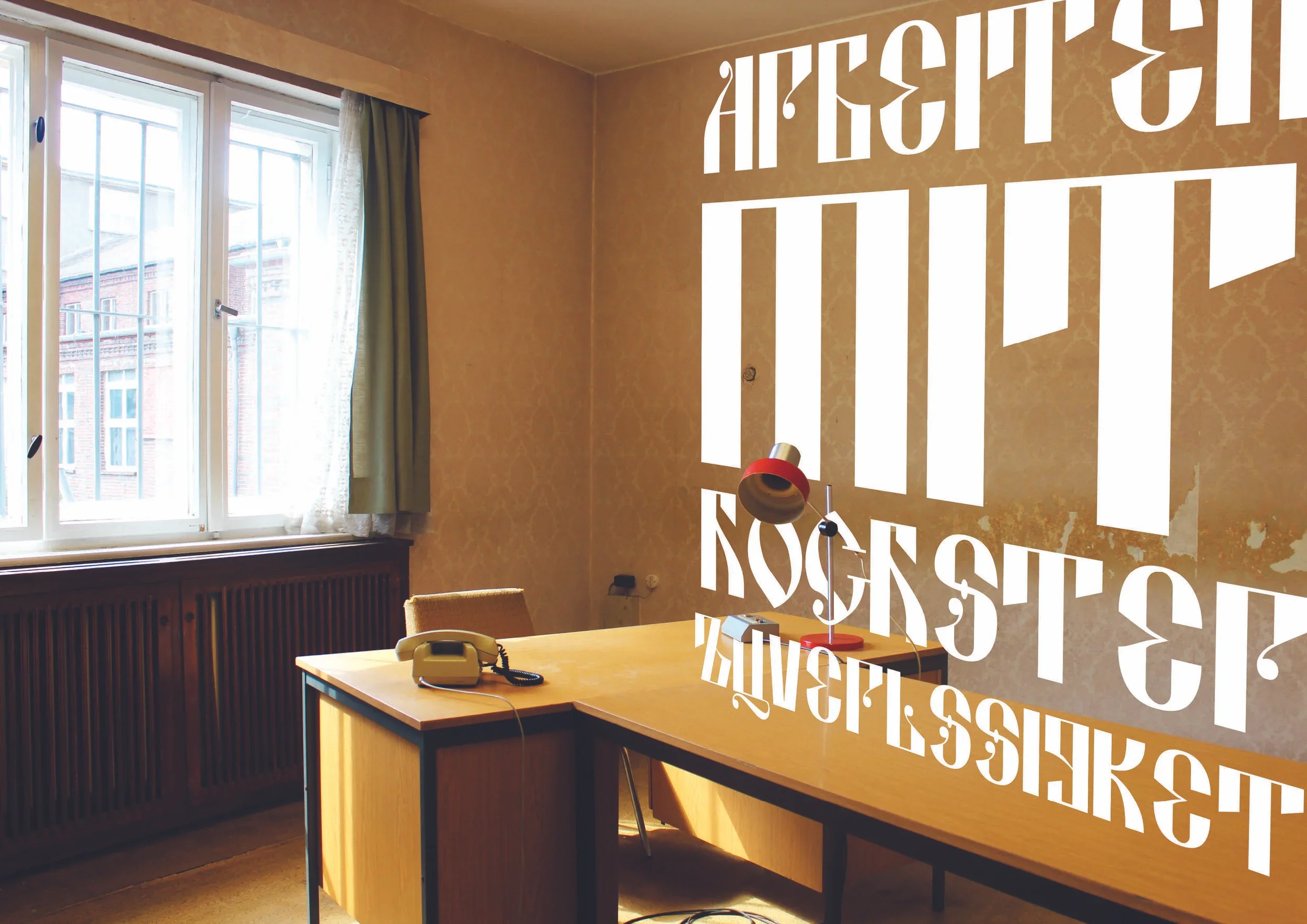
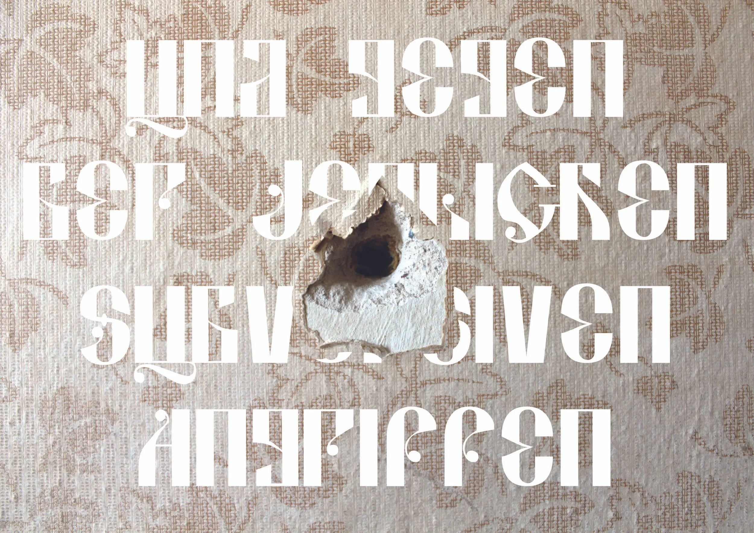
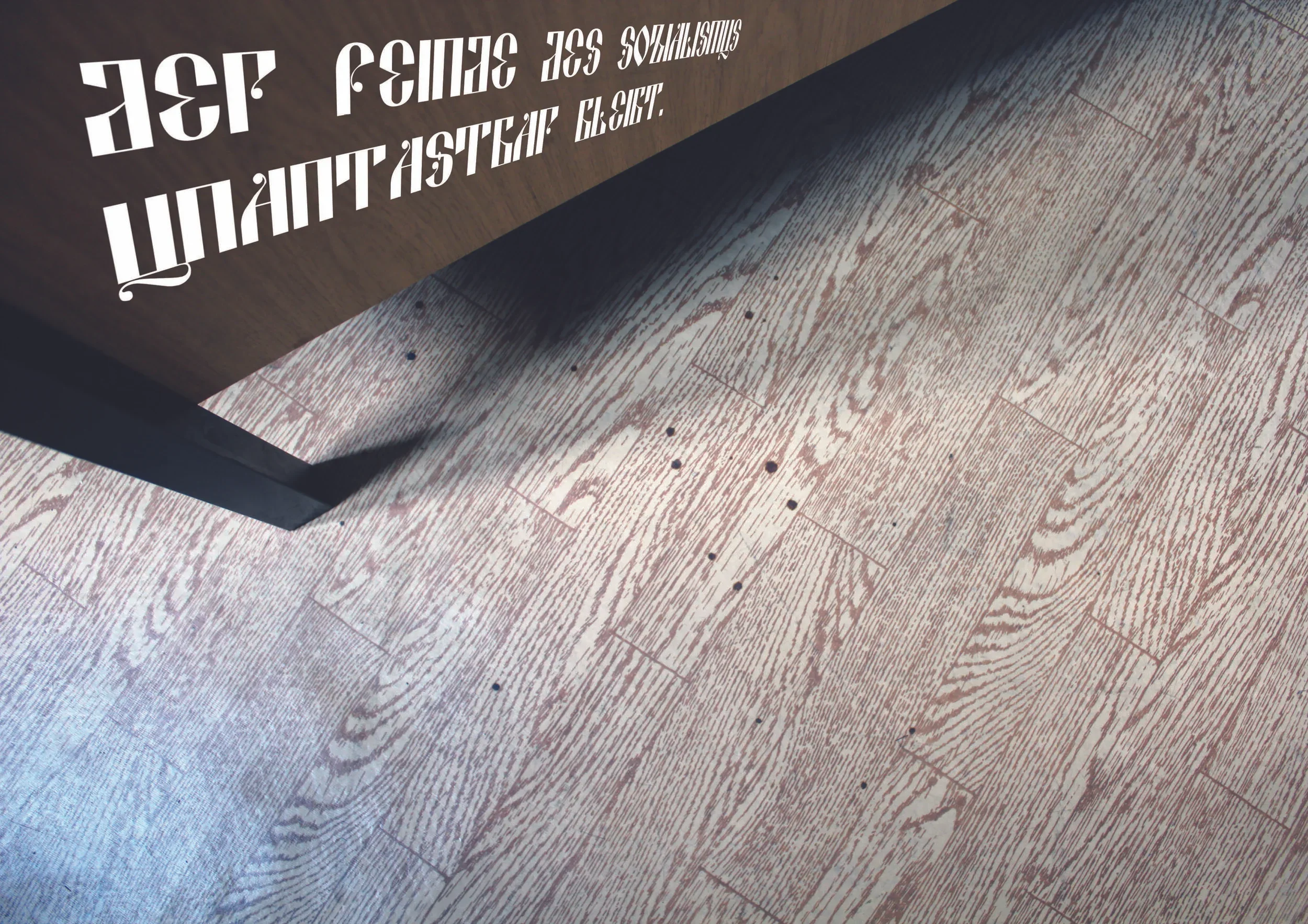
‘The Berlin Series’ — During a photography tour of Europe, I was tasked with taking a series of five photos in Berlin, themed around surveillance. As a token designer in a group of photographers, I was encouraged to treat the series as graphic posters.
These final five photos are from the Berlin-Hohenschönhausen Memorial, a prison preserved after the fall of the DDR, which was a period of intense surveillance in Berlin’s history. During my visit I was struck by an interesting contrast, which I decided to capture – preserved interiors with soft furnishings and warm wallpapers that provide a sense of almost-normalcy, with only museum panels and subtle hints of wear to reveal the true history which took place in these offices and interrogation rooms.
The series is juxtaposed against a quote from Stasi general secretary, Erich Honecker, split across the five images and translated as, “The communists in the Ministry of State Security departments work with the utmost reliability in order to further consolidate the power of the workers and farmers and to remain inviolable against any subversive attacks by the enemies of socialism.”
The typography is inspired by the rigidity and austerity of Russian Constructivist design.